SMC Building Services

The Brief
Project Overview.
Our collaboration with SMC Building Services aimed to revolutionize their digital presence, aligning with their core services in Mechanical Engineering, Air Conditioning, Plumbing, and Ventilation. Recognizing the unique challenges faced in the building services industry, our mission was to craft a dynamic online experience that showcased SMC’s expertise.
Skillsets Utilized:
- Branding
- Web Design
- Animation
Proposition Development.
Introducing “SMC Building Services,” a comprehensive digital platform that not only mirrors SMC’s commitment to excellence but also streamlines user interactions in Mechanical & Engineering, Air Conditioning, Plumbing, and Ventilation. From intuitive navigation to engaging animations, SMC Building Services’ digital presence positions the company as an industry leader, offering clients and partners a digital hub that reflects the sophistication and efficiency of their on-site services.
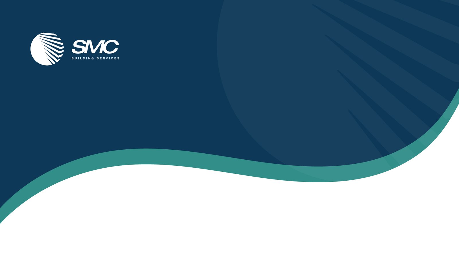
The logo design for SMC Building Services is a thoughtful fusion of elements that encapsulate the company’s essence and values.
Modern Building Facade Inside a Circle: The choice of a modern building facade within a circle serves as a visual metaphor for SMC’s commitment to contemporary and cutting-edge solutions in Mechanical & Engineering, Air Conditioning, Plumbing, and Ventilation. The circle symbolizes unity, wholeness, and a holistic approach to building services.
Representing International-Styled Architecture: By incorporating a modern building facade, the logo communicates an international design aesthetic. This choice reflects SMC’s capacity to deliver services aligned with global architectural trends, positioning the company as a player in the international arena.
Blue and White Color Palette: The blue and white color palette was chosen with intent. Blue symbolizes trust, reliability, and professionalism, crucial attributes in the building services industry. White complements this by signifying cleanliness, precision, and a commitment to quality. Together, these colors project an image of a company that is dependable and forward-thinking.
Logo
Italic Font for Forward and Solid Direction: The use of italic font adds a dynamic and forward-leaning quality to the logo. It signifies progress, innovation, and a solid, unwavering direction. This choice echoes SMC’s commitment to moving forward, staying ahead of industry trends, and providing steadfast services.
In summary, every element of the logo is purposeful. The modern building facade, encircled and presented in blue and white, portrays an international and trustworthy brand. The italic font complements this visual identity, symbolizing progress and solidity. Together, these design choices create a logo that not only represents SMC Building Services but also communicates its values, expertise, and commitment to excellence in the field of building services.
Typography
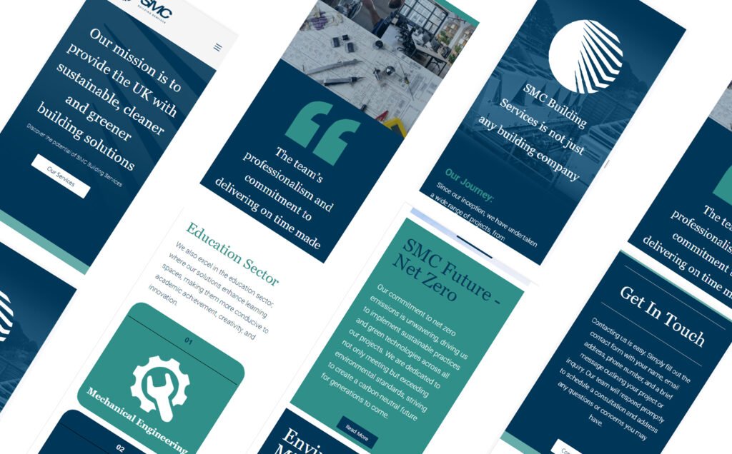
Web Experience: Navigating Excellence with SMC Building Services
SMC Building Services’ web experience is a meticulously crafted digital journey that mirrors the precision and quality of their company. Designed with user-centricity at its core, the website ensures intuitive navigation, guiding visitors through a well-structured layout. The responsive design adapts to various devices, offering a consistent and visually appealing interface. Engaging images to animations, bring SMC’s services to life, providing informative and captivating content. SMC’s web experience is not just a digital presence; it’s a reflection of the company’s commitment to excellence, offering clients and partners a dynamic and informative platform that solidifies SMC Building Services as an industry leader.
Web Experience